hi5 Networks Brand Refresh
The Challenge
At the time, hi5 was one of the most visited social networks globally and had just begun transitioning into a social gaming platform. Despite its scale and success, the visual identity felt outdated and didn’t reflect the company’s new focus. The challenge was to design a new logo and UI pattern that communicated a fresh, modern feel. Something that aligned with gaming culture and positioned hi5 as a fun, relevant destination.
My role: Design
The starting line
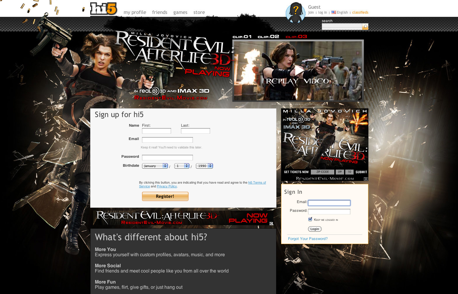
The existing design was clearly outdated and failed to convey the energy or personality of a fun, modern gaming company.
The process
The logo began to take shape once I landed on the right “5” form. It was crucial that it read clearly as a number, not an “S.” I leaned toward a slab serif style for its strong legibility and subtle reference to vintage slot machine numerals, which helped tie the mark to gaming culture without being overly literal.
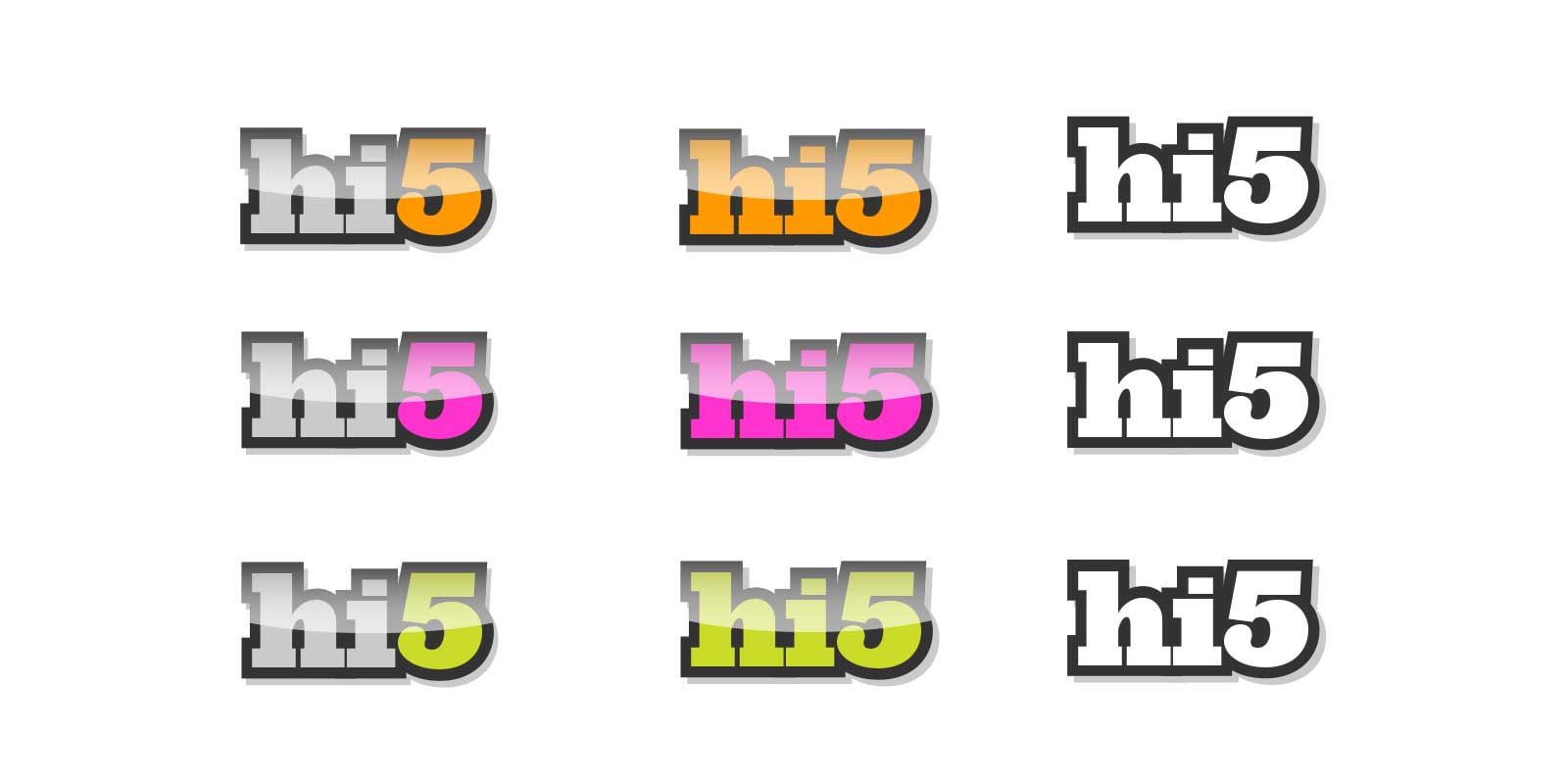
I explored a wide range of highlight colors during the design process. Feedback from focus groups helped us identify which options resonated most with users. In the end, we chose orange, a color with historical ties to the hi5 brand, striking the right balance between familiarity and freshness.
The final product
hi5 Light — the updated primary logo designed to reflect the brand’s shift toward a brighter, more playful identity.
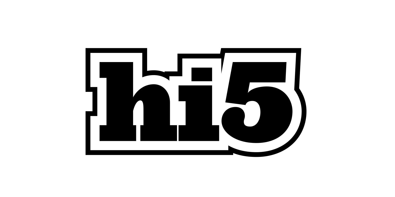
hi5 Dark — the secondary logo, created for use on darker backgrounds and in contexts where a bolder, more high-contrast presence is needed.
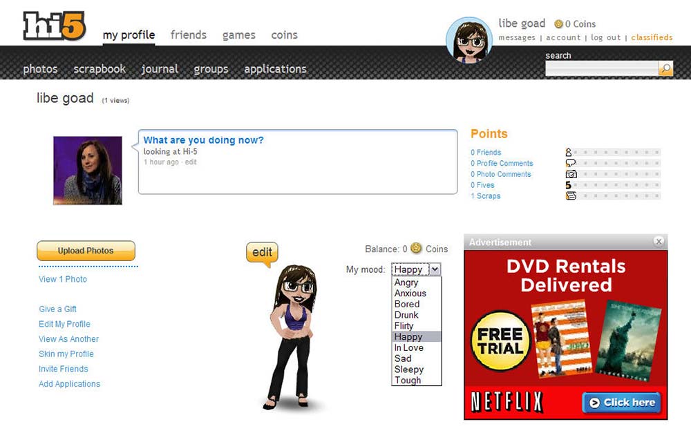
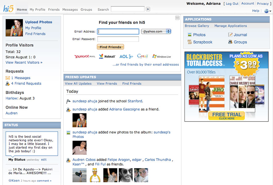
We took an incremental approach to modernizing the site’s UI, starting with a redesigned profile header and phasing out dated elements like background gradients to create a cleaner, more streamlined look.